We developed: name, visual identity, communication strategy
Skhovok is a house located 1007m above the ground in the Ukrainian Carpathian Mountains, which can be rented out for a vacation. The word “Skhovok” means hideaway in Ukrainian.
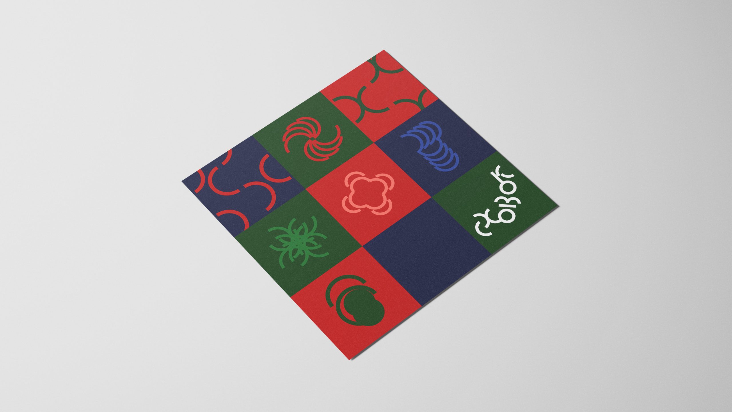
The primary metaphor of the idea is the essence of a child's game of hide-and-seek for adults. The game continues in the visual identity. The shapes of the logo letters are built from basic modules of arcs. The composition of the logo is designed in such a way that it reflects an upward movement from the first letter "C" to the last "K", which seems to be standing on top of a mountain. The additional feature is the variable stroke width of the letters which lets the logo almost disappear or become bold and loud depending on the task of communication.
As the main colors of the Skhovok brand, we use rich natural colors found in the Carpathians at different times of the year: dark and light green of the Carpathian fir trees, dark and light blue of the Carpathian streams and lakes, red of the Carpathian berries and fire in the fireplace.